Starting To Take Shape
A fair bit has changed since the last update, both visually and behind the scenes.
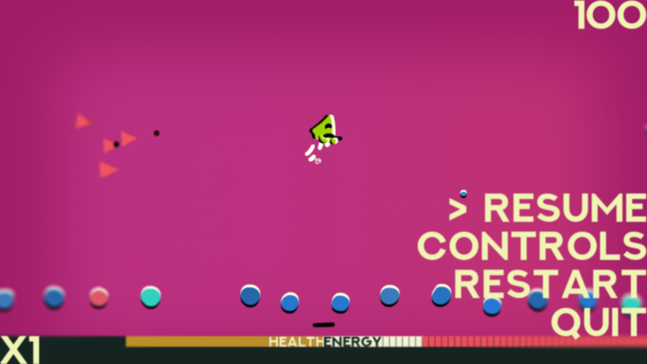
The most obvious thing is the change in colour for the background I guess, which I did so that I could have more options for how the enemies look. Because the player is towards the green / blue end, it'd be a bit confusing if the enemies were similar colours, so freeing up the background from red allows me to play about with the reds for the enemies instead.
I also managed to design a simple multiplier mechanic and to tie it in with the UI at the bottom of the screen, along with the health and energy bars. I wanted it to be pretty bold so that the player can be aware of it without having to look away from the action too much. The multiplier bar increases with every enemy kill, pauses for a few seconds and then reduces until it's at zero or you make another kill - when it fills up, the multiplier goes up by one and applies it to any subsequent scoring. You can also briefly pause the bar when it's going down by popping one of the buttons in order to keep the chain going when there are no enemies around.

The visual design of the multiplier bar is based on another of Norman McLaren's films called Sychromy, where he painted on the soundtrack of the film to make the sound - totally worth a watch, it gets pretty crazy!
The buttons also now spawn particles when they're popped which get sucked in by the player, refilling the energy or health bars depending on their colour. I also simplified their design a bit and abandoned the Zoetrope effect when the player dashes, as it wasn't really that visible when you're concentrating on the game, and it was dictating the length and speed of the dash as well, making it feel too out of control. I'm still going to try to implement the Zoetrope frames appearing as the buttons are popped, as in previous versions, but I'm maybe a bit more open to just abandoning that altogether if it doesn't feel right or is just too forced.

Lastly (I think), I designed an enemy wave / formation system and a couple of different enemy types that only spawn once there are a certain amount left in the level. I managed to figure this bit out all on my own, somehow! The enemies still need a lot of work so that there's enough variety visually and mechanically, but I've got the systems set up so I can eventually design the level properly.
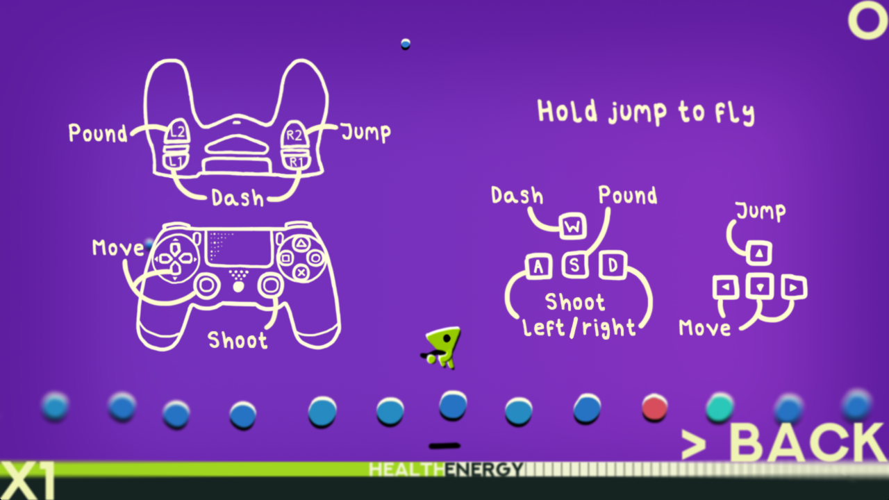
Oh, and a menu and pausing system too! And a badly done shader for pickups and damage feedback. Next time I hope to have a playable demo of some sort ready!


ZOE Begone!
A drawn on film shmup
| Status | In development |
| Author | Retchy |
| Genre | Shooter, Action |
| Tags | Arcade, GameMaker, Hand-drawn, Shoot 'Em Up, Side Scroller, Twin Stick Shooter |
| Languages | English |
More posts
- ZOE Begone! Out Now!96 days ago
- ZOE Begone! Release Date!Aug 13, 2025
- ZOE Demo 0.14.1 ReleasedMay 26, 2020
- New Power UpsMar 28, 2020
- Level TransitionJan 27, 2020
- ZOE 0.13.2 Update and Mac Version ReleasedAug 20, 2019
- ZOE 0.13.1 Update Released - Tutorial AddedJul 19, 2019
- ZOE 0.13.0 Update Released - New Power Up System!Jun 07, 2019
- Boss Fight DevelopmentApr 10, 2019
- ZOE (Actual Title Now!)Jan 22, 2019

Leave a comment
Log in with itch.io to leave a comment.