Boss Fight Development
I've spent the last couple of months working on the first boss fight, and re-working the formation system, along with a bunch of other smaller tweaks.
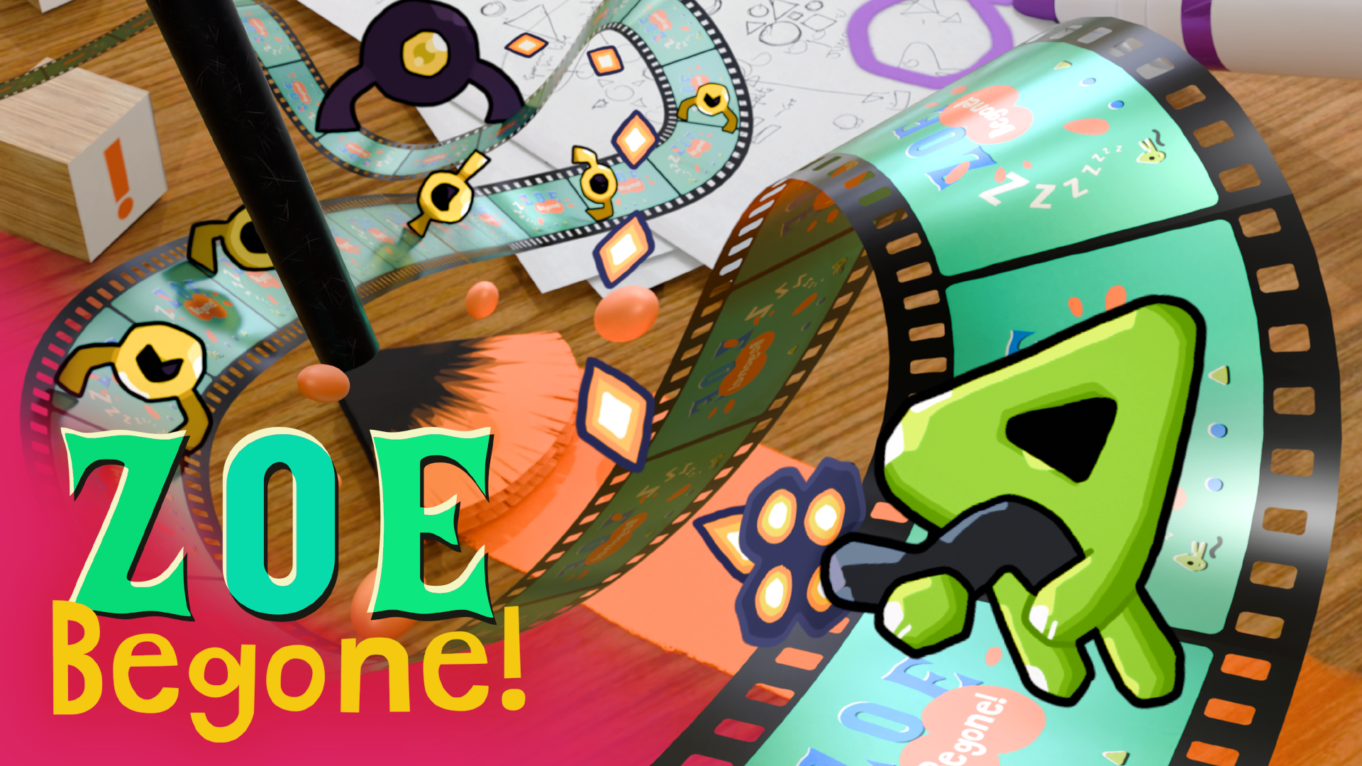
Having finally figured out and nailed down the concept and context for the game (see my previous post for more detail on that), it was clear that the boss would have to be the animator's paintbrush that's antagonising the player throughout the level, but how would the battle actually play out?
I decided pretty quickly that I'd need to somehow pause the side scrolling and create some sort of arena in order to contain the fight, mainly because it seemed like it'd be a massive headache to deal with all of the scrolling and warping issues that would come up otherwise, but I also think it was the right call as it mixes up the gameplay style a bit, allowing the player to move more freely around the screen. To contextualise it, I came up with the 'Frame Trap'!
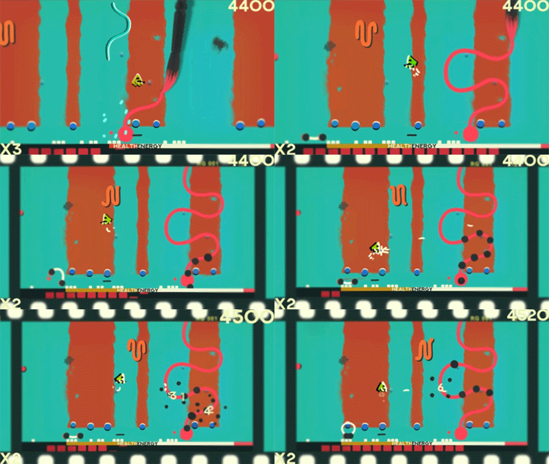
The camera pulls out to reveal the black frame boundaries which also act as walls to keep the player trapped. I was really happy with this as it solved the game design problem and added to and reinforced the context of the game world.
From here it was relatively easy - I came up with a few ideas for the kind of attacks the brush could do and set about implementing them with a spawning system that randomises the order they appear in. There's also a countdown to when the frame trap happens, so the player is able to get into a position where there are some health or energy resources to use during the fight. It's a fairly easy boss to defeat, but there's room to adapt the difficulty in the future, and I'm pretty happy with how it's turned out. 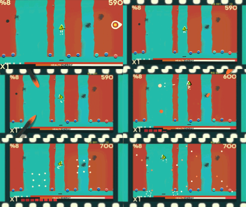
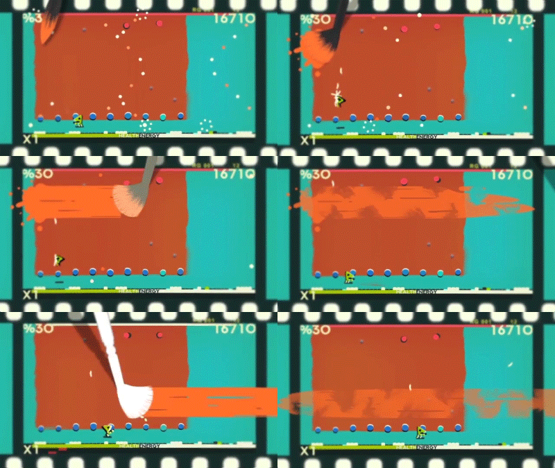
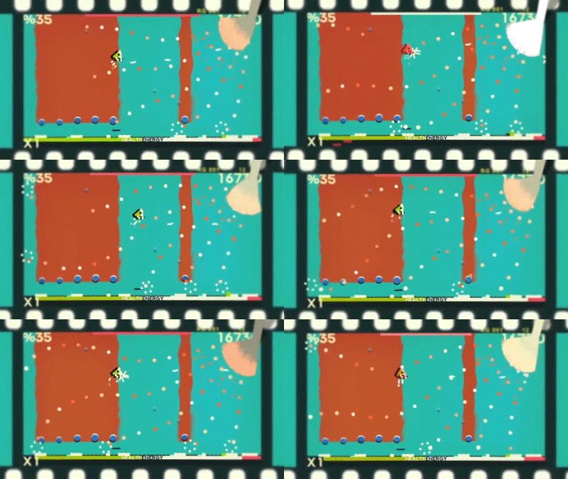

Some of the smaller tweaks I've made recently include the mini map at the bottom of the screen which indicates where health dots are and whether any of the dots have been popped or not (I plan to make this scroll with the player, so that the green indicator (the player) stays in the central position and the others move around that, as I think it'll make it much easier to read), a camera zoom out for when the brush appears throughout the level (but without stopping the side scrolling), to further emphasise to the player when it does appear (especially if it's off screen), and again, to push the context even more, a slightly different order of events in the title screen, and a small how to play guide. I'm sure there's other stuff I've forgotten.
Thanks for reading - please feel free to download the WiP demo and let me know what you think!
Cheers!
Graeme
Files
Get ZOE Begone!
ZOE Begone!
A drawn on film shmup
| Status | In development |
| Author | Retchy |
| Genre | Shooter, Action |
| Tags | Arcade, GameMaker, Hand-drawn, Shoot 'Em Up, Side Scroller, Twin Stick Shooter |
| Languages | English |
More posts
- ZOE Demo 0.14.1 ReleasedMay 26, 2020
- New Power UpsMar 28, 2020
- Level TransitionJan 27, 2020
- ZOE 0.13.2 Update and Mac Version ReleasedAug 20, 2019
- ZOE 0.13.1 Update Released - Tutorial AddedJul 19, 2019
- ZOE 0.13.0 Update Released - New Power Up System!Jun 07, 2019
- ZOE (Actual Title Now!)Jan 22, 2019
- New EnemiesJul 20, 2018
- Starting To Take ShapeApr 24, 2018
Comments
Log in with itch.io to leave a comment.
This game looks really awesome, thanks for sharing your process. I put you up on the fresh games section on the itch.io homepage.
Thanks very much! :D